Directional Web Designs

Fonts and Typography
For some people, typography is simply about arranging a familiar set of shapes to make words, sentences, and paragraphs. Having the ability to set type with only a few strokes on a keyboard has allowed us to forget about the creative and artistic possibilities of this medium.
When it comes to choosing fonts for text that will be displayed in a browser, you have to think in terms of the lowest common denominator. The number of font families that are supported across major operating systems is very small. There is nine font families commonly known as the safe list.
The list includes: Arial, Arial Black, Comic Sans MS, Courier New, Georgia, Impact, Times New Roman, Trebuchet MS and Verdana.
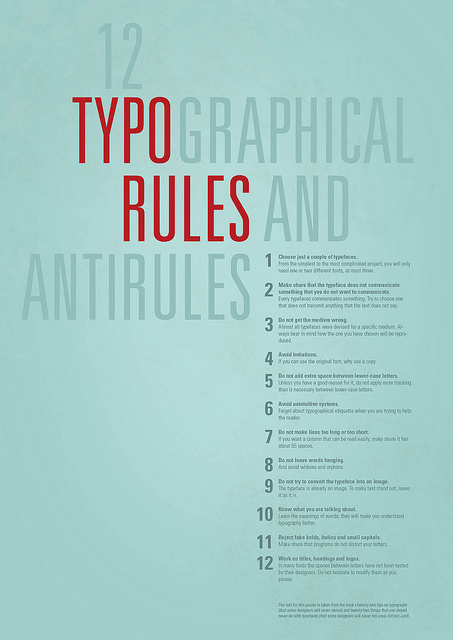
The following is a list of some practical typography guidelines which will help you improve the overall usability of your website:
- Keep the number of fonts used at a minimum: Using a lot of fonts (more than 3 different fonts) makes a web site look unstructured and unprofessional
- Use sans serif fonts instead of serif for content: Sans serif fonts are more suited for the screen than serif fonts which are better suited for headings and print
- Ensure that proper text and text size is used: It is recommended that Arial Trebuchet and Georgia are at 10pts+, Times New Roman at 12pts+ whilst Comic Sans and Impact fonts are not used
- Content must make use of mixed capitalization: Having all text in caps or small caps makes it difficult for the user to read and scan it. All caps text makes a web site look unprofessional and untrustworthy
- Use standard fonts for web site fonts: Users are more familiar with standard fonts and can thus read them faster
- Character spacing should not be minimized: Altering the character spacing to fit in more text, makes it more dense and difficult to scan
- Limit the use of different colors for fonts: When text is over-designed, it affects its meaning. Additionally, users may mistake over-designed text for adverts. Thus it is recommended that 4 different colors or less are used to color text