Color
Basic Concepts
- Using more than 4 or 5 colors creates inconsistency, making it hard for important words to pop out which can then stress the reader. If your page upsets the reader, they will leave your page and possibly never return.
- Use simple colors to allow for content to be able to cross platforms easily. Make sure you consider how content will look on on the Web and mobile devices. Certain colors might not look the same on your Mac or PC as they look for the audience.

What to consider when choosing a color scheme
Audience: Be aware of the age and gender of your audience as well as the purpose of your site. A site for a professional business might use colors that are contemporary and basic whereas a website for boy scouts might use bright and fun colors found in nature.
60/30/10 Principle: Use the 60/30/10 principle to create a pleasing balance to the eyes . The main color is about 60 percent of the website's background, the secondary color is about 30 percent, and an accent color is about 10 percent.
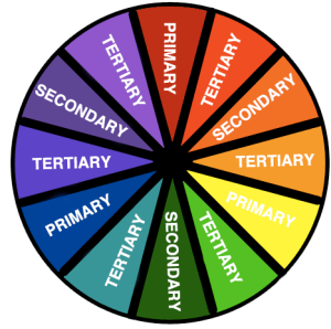
Color Combinations: Choose color combinations on a color wheel that are harmonious and work well together. For example22-bad-colors.jpg
Analogous: These are colors next to each other on the color wheel, like yellow, yellow-green, and green. Harmonies that are analogous tend to be less-obtrusive and less of a contrast due to their likeness.
Complementary: Colors that are across from each other on the color wheel. This is usually the most common way to start a color theme. Complementary colors are good to use because they naturally amplify each other. Many designers use a base color and use complementary colors to accent the base.
Monochromatic: These are different shades of the same color
Split-complementary: One color plus two others equally spaced across from it on the color wheel.
Triadic: Three colors that are equally spaced apart on the color wheel. These harmonies tend to be of higher contrast from each other. Many themes that use triadic colors use one or two colors as a base and then use the other color(s) as accents.
Color Psychology:
Certain colors evoke certain emotions and thoughts. Below is a breakdown of which colors are associated with certain emotions:
Blue: Blue is the most commonly used color in web design because it matches well with other colors and it evokes feelings of security and trust. It is also a very calming color so it helps viewers feel relaxed when viewing your webpage.
Green: Green is often associated with nature and tranquility, however darker greens are associated with money.
Brown: Brown gives a very earthy feel to your website, but if used incorrectly it can make your website appear dirty.
Yellow: Yellow is a very energetic color, it gives off positivity and warm.
Red: Red is a color that is closely tied to passion and anger, but as mentioned before it can also be used as an appetizer.
Purple: Purple is a color commonly used to signify royalty or spirituality. It also has a nice tendency of invoking feelings of creativity, making it a popular choice for creative agencies.
Pink: Pink is a very feminine color and depending on the shade of pink you use, it can mean different things. Bright and lighter pinks are exciting and fun while darker shades of pink will be considered more romantic.
Orange: Orange is rarely seen as a website's main color, but you will often see it used as a secondary color or highlight color. Orange is very playful and fun and small doses of it can turn a bland webpage into a vibrant and exciting page.
Black: Black conjures a feeling of high class and exudes sophistication. You'll often see a simple black color theme used for luxury and high-quality products.
White: White represents purity and cleanliness. A white webpage is also very effective for the modern minimalistic look that is very trendy nowadays.