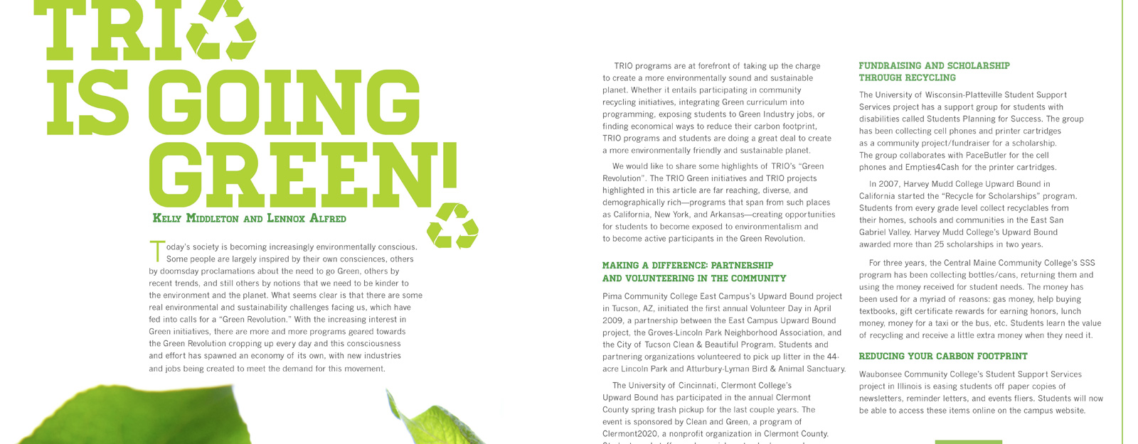
book design
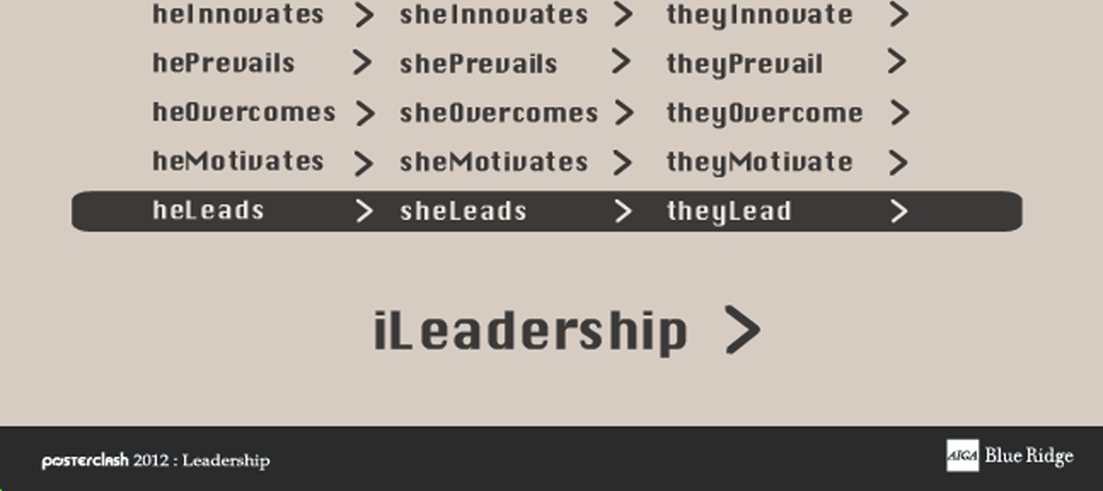
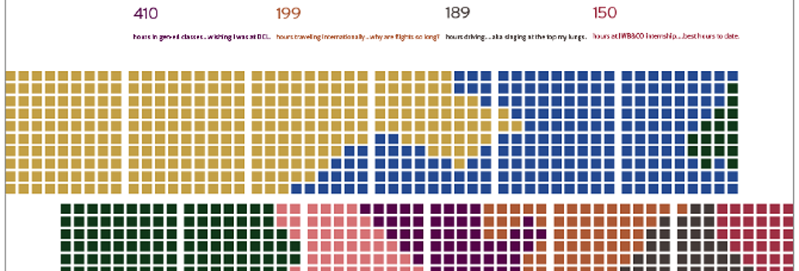
poster design
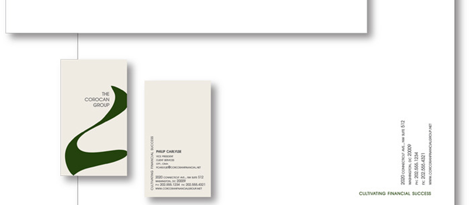
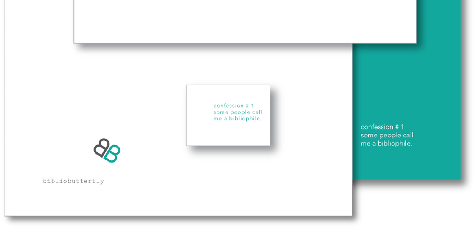
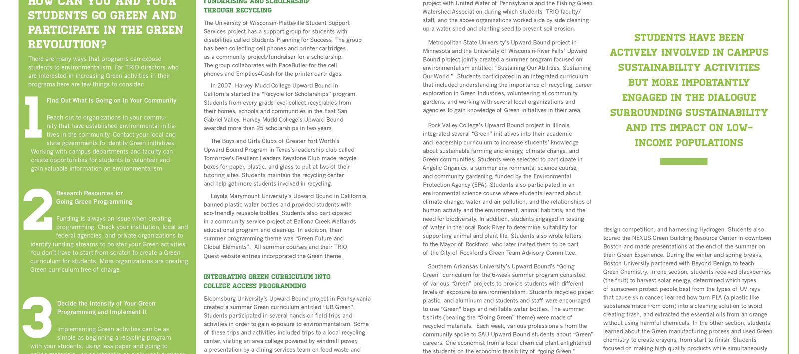
branding and magazine layout
This is a selection of my graphic design work. It is set up into bars by categories: book, poster, and branding and layout. MY style when it comes to graphic design is simple, clean, and structured lines with a fun and flirty use of color to upscale the project. I enjoy a good contrast of color and am one hundred precent postive that gray type looks so much more safisticated and more beautiful then pure black. That being said you will always seen gray type in my design when it allows, which is usually always, thank the design gods. I hope you get a sense of aesthetic and design process within these projects but more importantly I hope you like them!
|
