| Color Tools and Resources |
 | You probably know enough about colors to talk about their values, intensities, psychological associations, temperatures, and locations on the traditional color wheel; however, how do we find multiple colors that work together? This is where color schemes come in handy. Color schemes are the basic formulae for creating harmonious and effective color combinations.br> There are two main ways to specify colors in style sheets, one with a predefined color name (color: red;) or with a numberic value that describes a particular RGB color (color: #FF0000;). A more accurate view is available at http://html-color-codes.info/#HTML_Color_Picker. |
| What should you consider when choosing a color scheme? |
- Audience: Be aware of the age and gender of your audience as well as the purpose of your site. A site for a professional business might use colors that are contemporary and basic whereas a website for boy scouts might use bright and fun colors found in nature.
- 60/30/10 Principle: Use the 60/30/10 principle to create a pleasing balance to the eyes . The main color is about 60 percent of the website's background, the secondary color is about 30 percent, and an accent color is about 10 percent.
- Color Combinations: Choose color combinations on a color wheel that are harmonious and work well together.
- Analogous: These are colors next to each other on the color wheel, like yellow, yellow-green, and green. Harmonies that are analogous tend to be less-obtrusive and less of a contrast due to their likeness.
- Complementary: Colors that are across from each other on the color wheel. This is usually the most common way to start a color theme. Complementary colors are good to use because they naturally amplify each other. Many designers use a base color and use complementary colors to accent the base.
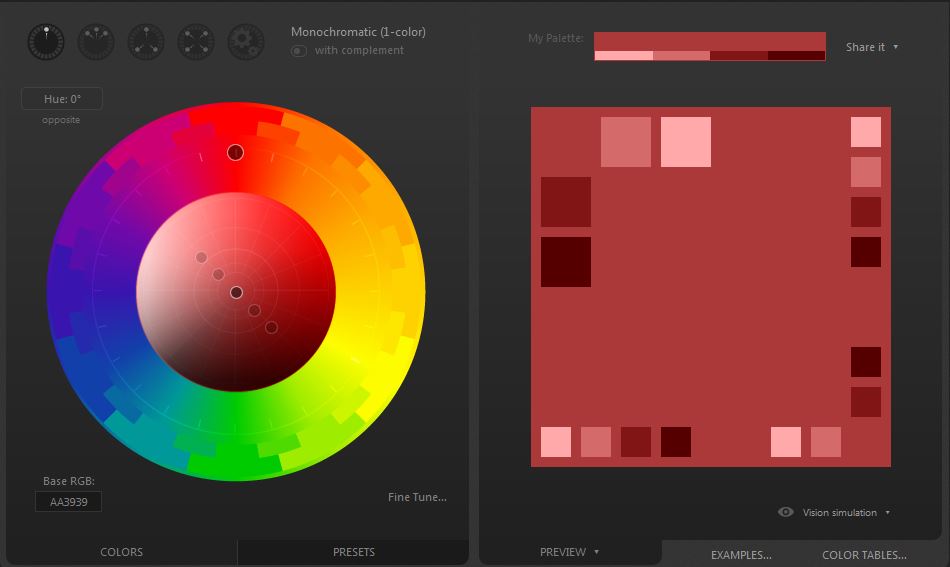
- Monochromatic: These are different shades of the same color.
- Split-complementary: One color plus two others equally spaced across from it on the color wheel.
- Triadic: Three colors that are equally spaced apart on the color wheel. These harmonies tend to be of higher contrast from each other. Many themes that use triadic colors use one or two colors as a base and then use the other color(s) as accents.
|