The following is a list of 12 practical typography guidelines which will help you improve the overall usability of your website:
- Keep the number of fonts used at a minimum: Using a lot of fonts (more than 3 different fonts) makes a web site look unstructured and unprofessional
- Use sans serif fonts instead of serif for content: Sans serif fonts are more suited for the screen than serif fonts which are better suited for headings and print
- Ensure that proper text and text size is used: It is recommended that Arial Trebuchet and Georgia are at 10pts+, Times New Roman at 12pts+ whilst Comic Sans and Impact fonts are not used
- Content must make use of mixed capitalization: Having all text in caps or small caps makes it difficult for the user to read and scan it. All caps text makes a web site look unprofessional and untrustworthy
- Use standard fonts for web site fonts: Users are more familiar with standard fonts and can thus read them faster
- Character spacing should not be minimized: Altering the character spacing to fit in more text, makes it more dense and difficult to scan
- Limit the use of different colors for fonts: When text is over-designed, it affects its meaning. Additionally, users may mistake over-designed text for adverts. Thus it is recommended that 4 different colors or less are used to color text
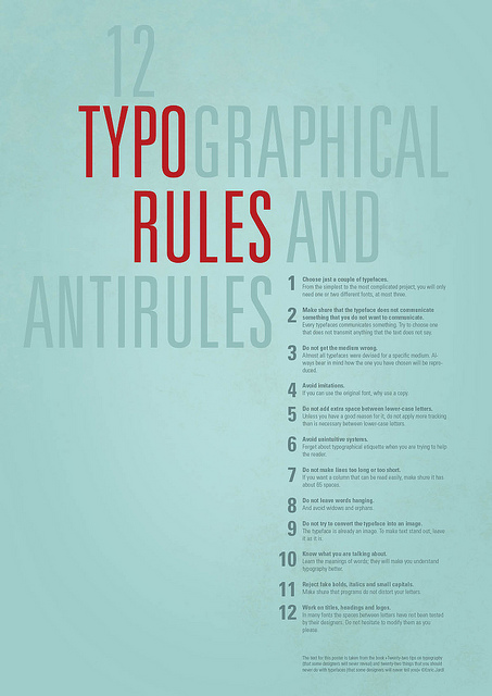
- Choice just a couple of typefaces
- insert text
- insert text