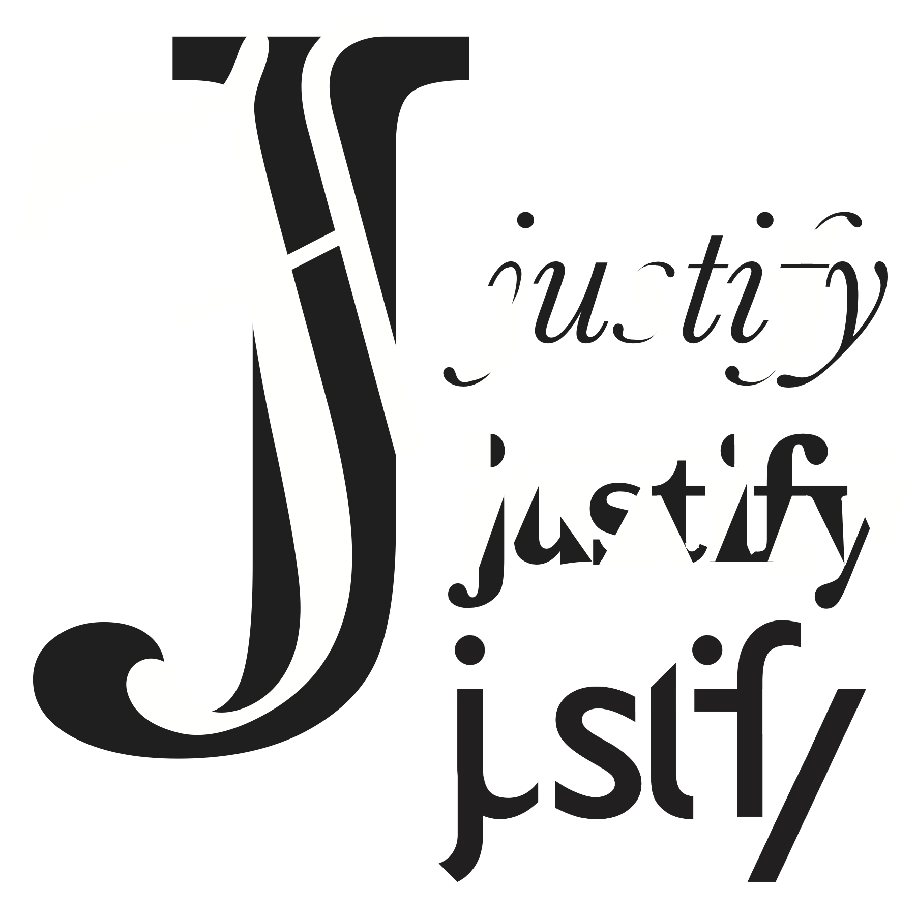
Justify: Typographic Study
The purpose of this study was to focus on the anatomy of the letter. There were two parts to this project, to create one letter form out of three variations of an individual letter, and then to take a word starting with the given letter and break it down as much as possible, still maintaining it's legibility.
Given the letter "J" it proposed a challenge creating an interesting letterform in a thin space. I resolved this conflict by using a thin typeface as well as an italic too


