
Just Arrived
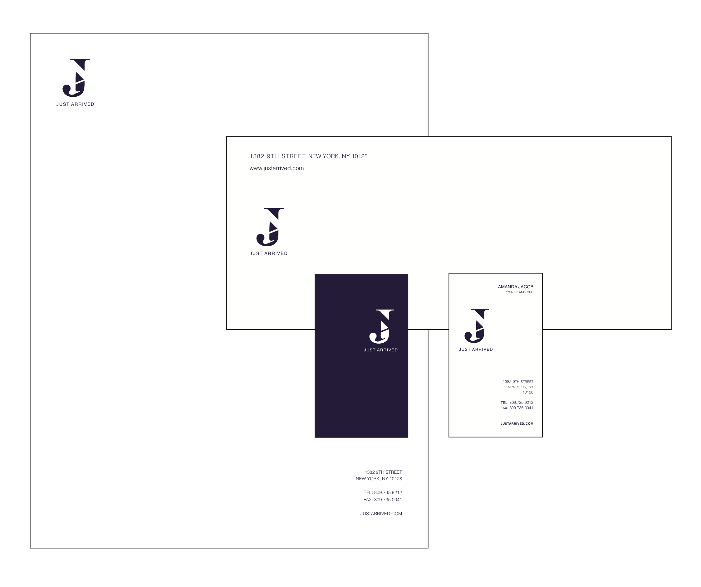
Just Arrived is a luxury boutique in the center of New York City. Selling predominantly clothing as well as other luxury items, the store is ever changing with the time and are constantly changing to stay up to date with current trends.
The object of this project was to create a letterform logo based on the combination of two letters. I had to create a new design through the manipulation of each character. Must try and maintain a balance between two letterforms; trying not to make one more dominant than the other while maintaining the intergrity of each letter.
Being both modern and forward thinking, the design concept of Just Arrived, deals with very sleek lines to compliment the clear and simple logo. Taking into consideration contrast, shape, style, size and space. I came to the conclusion of my letterform by overlapping letters and creating negative space by extracting the "A" from the letter "J". I chose to use two characters of the same typeface because they hold together best, creating implied shapes.