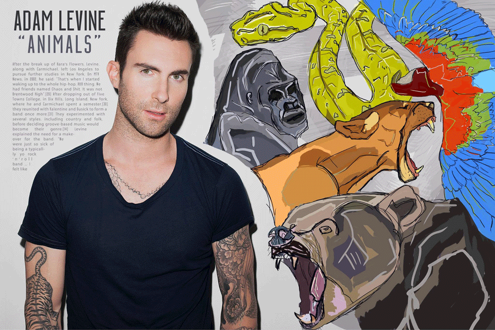
When desiging for print media like magazine spreads, I approach them in a similar way as I do posters; layout, type, image, details. Particularly with spreads I like to see how the type can augment the image as well as stand on its own. A lot of times I am asked how do you make your body copy relate to the image when it tends to be so standard. And to that I say layout. The way the grid is set.
Animals
Adobe Photoshop
This spread is an interpretation of the song "Animals" by Maroon 5. If you've seen the music video, it's very dark and unsettling and I wanted to take this in a very different direction, playing very literally on the title.


