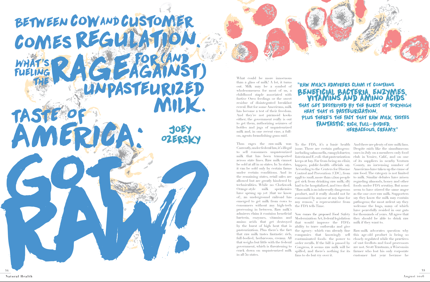
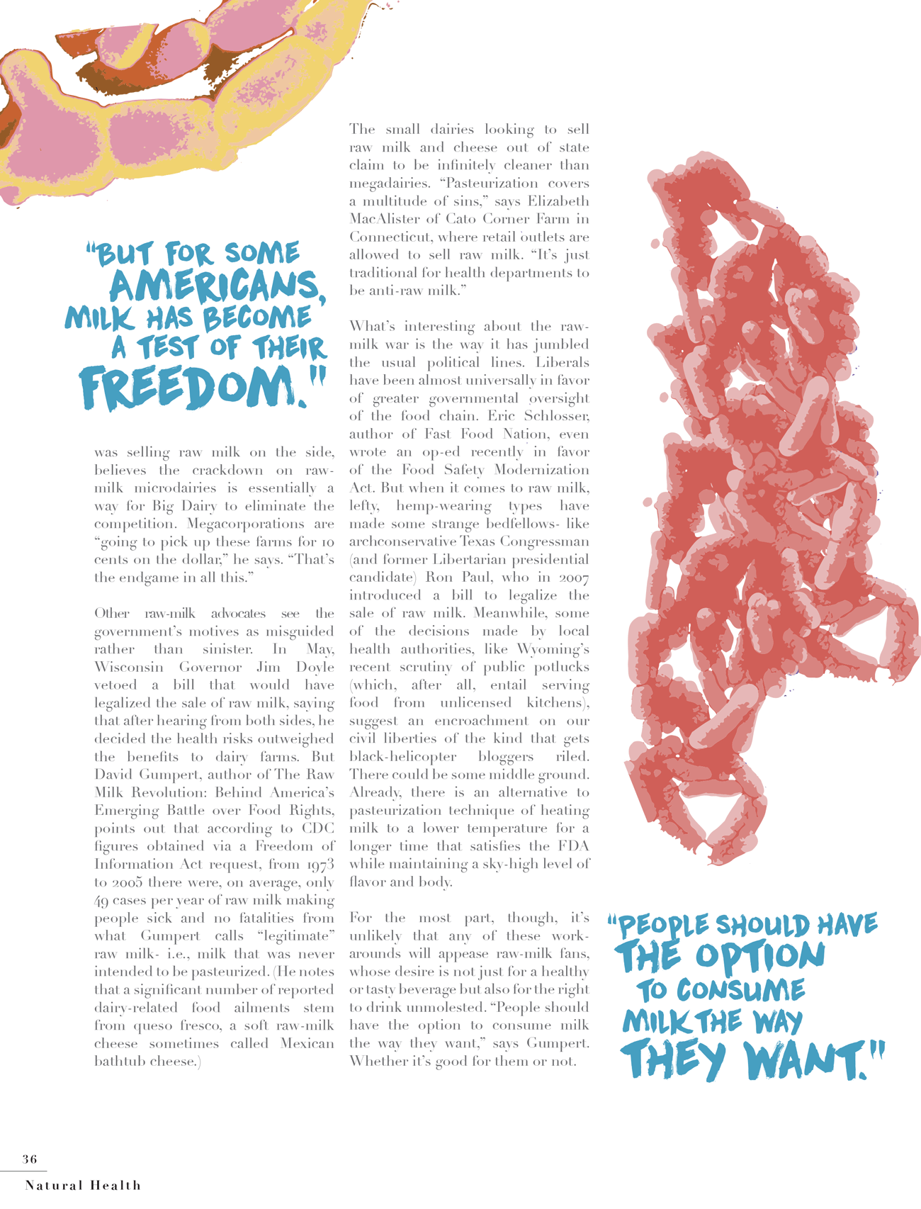
When desiging for print media like magazine spreads, I approach them in a similar way as I do posters; layout, type, image, details. Particularly with spreads I like to see how the type can augment the image as well as stand on its own. A lot of times I am asked how do you make your body copy relate to the image when it tends to be so standard. And to that I say layout. The way the grid is set.
Unpasturized Milk
Adobe InDesign & Illustrator
This spread is an interpretation of the song "Animals" by Maroon 5. If you've seen the music video, it's very dark and unsettling and I wanted to take this in a very different direction, playing very literally on the title.

